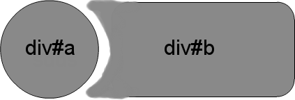
Актуализация: CSS3 опция за радиален фонов градиент
(За тези браузъри, които го поддържат - тествани във FF и Chrome - IE10, Safari също трябва да работи).
Един „проблем“ с първоначалния ми отговор са тези ситуации, при които човек няма солидна предистория, срещу която работи. Тази актуализация създава същия ефект, като позволява прозрачна „празнина“ между кръга и неговия обратен изрез.
CSS
.inversePair {
    border: 1px solid black;
    display: inline-block;
    position: relative;
    height: 100px;
    text-align: center;
    line-height: 100px;
    vertical-align: middle;
}

#a {
    width: 100px;
    border-radius: 50px;
    background: grey;
    z-index: 1;
}

#b {
    width: 200px;
    /* need to play with margin/padding adjustment
       based on your desired "gap" */
    padding-left: 30px;
    margin-left: -30px;
    /* real borders */
    border-left: none;
    -webkit-border-top-right-radius: 20px;
    -webkit-border-bottom-right-radius: 20px;
    -moz-border-radius-topright: 20px;
    -moz-border-radius-bottomright: 20px;
    border-top-right-radius: 20px;
    border-bottom-right-radius: 20px;
    /* the inverse circle "cut" */
    background-image: -moz-radial-gradient(
        -23px 50%, /* the -23px left position varies by your "gap" */
        circle closest-corner, /* keep radius to half height */
        transparent 0, /* transparent at center */
        transparent 55px, /*transparent at edge of gap */
        black 56px, /* start circle "border" */
        grey 57px /* end circle border and begin color of rest of background */
    );
    background-image: -webkit-radial-gradient(-23px 50%, circle closest-corner, rgba(0, 0, 0, 0) 0, rgba(0, 0, 0, 0) 55px, black 56px, grey 57px);
    background-image: -ms-radial-gradient(-23px 50%, circle closest-corner, rgba(0, 0, 0, 0) 0, rgba(0, 0, 0, 0) 55px, black 56px, grey 57px);
    background-image: -o-radial-gradient(-23px 50%, circle closest-corner, rgba(0, 0, 0, 0) 0, rgba(0, 0, 0, 0) 55px, black 56px, grey 57px);
    background-image: radial-gradient(-23px 50%, circle closest-corner, rgba(0, 0, 0, 0) 0, rgba(0, 0, 0, 0) 55px, black 56px, grey 57px);
}
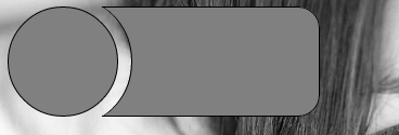
Оригинален отговор
Отне повече усилия, отколкото очаквах, за да накарам z-индексирането да работи (това изглежда игнорира отрицателния z-индекс), обаче, това дава хубав чист вид (тествано в IE9, FF, Chrome):
HTML
<div id="a" class="inversePair">A</div>
<div id="b" class="inversePair">B</div>
CSS
.inversePair {
    border: 1px solid black;
    background: grey;
    display: inline-block;
    position: relative;
    height: 100px;
    text-align: center;
    line-height: 100px;
    vertical-align: middle;
}

#a {
    width: 100px;
    border-radius: 50px;
}

#a:before {
    content:' ';
    left: -6px;
    top: -6px;
    position: absolute;
    z-index: -1;
    width: 112px; /* 5px gap */
    height: 112px;
    border-radius: 56px;
    background-color: white;
}

#b {
    width: 200px;
    z-index: -2;
    padding-left: 50px;
    margin-left: -55px;
    overflow: hidden;
    -webkit-border-top-right-radius: 20px;
    -webkit-border-bottom-right-radius: 20px;
    -moz-border-radius-topright: 20px;
    -moz-border-radius-bottomright: 20px;
    border-top-right-radius: 20px;
    border-bottom-right-radius: 20px;
}

#b:before {
    content:' ';
    left: -58px;
    top: -7px;
    position: absolute;
    width: 114px; /* 5px gap, 1px border */
    height: 114px;
    border-radius: 57px;
    background-color: black;
}
person
ScottS
schedule
08.05.2012